2 Data
2.1 Data Introduction
To further explore what factors influence life expectancy, we gathered data from the County Health Rankings data, which provides county-by-county data on several Health Factors and Health Outcomes. These specific factors can be broken down further into Health Behaviors, Clinical Care, Social & Economic Factors , and Physical Environment in addition to demographic variables. For our purposes, we created a panel dataset across 4 years, using data from 2017-2020. The health outcome we chose to explore is Life Expectancy, the average life expectancy for residents at the county level. We employed various data visualization techniques to help better understand the variables themselves and the relationship they have with each other to focus on only the most influential factors to life expectancy. We found this to be an interesting outcome to explore because of its simplicity: it is the average number of years a person is expected to live in each county. Additionally, it allows us to examine the healthiness of each county individually and create models that help explain what factors influence life expectancy. One thing to keep in mind when looking at the average life expectancy at the county level is the possibility that some smaller county populations can overestimate values. Another important fact about life expectancy before we begin our exploration, as stated on the County Health Rankings website is, “Age is a non-modifiable risk factor, and as age increases, poor health outcomes are more likely. Life Expectancy is age-adjusted in order to fairly compare counties with differing age structures.”
We begin our exploration looking at the possible changes of life expectancy across the US during our 4-year time period. Our panel dataset includes 4 years’ worth of data from 2017-2020, so the first thing we calculated was the average life expectancy for each these years.
| Year | Avg. Life Expectancy |
|---|---|
| 2017 | 77.44 |
| 2018 | 77.47 |
| 2019 | 77.51 |
| 2020 | 76.90 |
As we can see in Table 2.1, we see almost identical life expectancy values for 2017, 2018, and 2019, with extremely small differences between the 3 years. However, in 2020 we see that the average life expectancy decreases by roughly 0.6 years. This decrease may be attributed to many health and sociopolitical factors that occurred during 2020 including the Covid-19 pandemic and nationwide social unrest. The reason we found this to be important was for visualizing the variation of life expectancy among counties. Since there is very little variation from year to year, we chose to display just the 2017 life expectancy values for each county in the following map:
Figure 2.1: Map 1
In Map 1, shows the wide range of variations of life expectancy, ranging from roughly 63 years to almost 98 years of age. One note to make is that we do not include Alaska, Hawaii, or Puerto Rico in our map for ease of computation. We also see many geographical trends with counties that have lower or higher life expectancy usually located in the same general region. Due to the large size of the US and numerous counties, we do see such a large variation in values. While Map 1 helps us see the variation from county to county in 2017, we also felt it was necessary to explore the average life expectancy from state to state across the 4 years, as Figure 2.2 highlights. This figure shows us much less variability from state to state from 2017-2020. There is still approximately an 8-year difference in average life expectancy, so it is imperative that we look at other variables that might help us understand what factors into life expectancy.
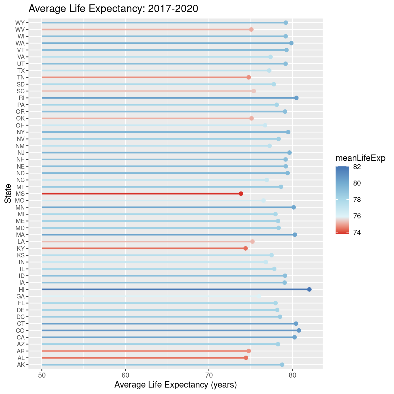
Figure 2.2: State Life Expectancy
2.2 Variable Exploration
We included 6 variables from the 4 health measures in addition to 2 demographic variables. The first variable we included comes from the social and economic health factor, Median Household Income. Median household income is the median income of all households in that county. Income has many factors on the physical and mental well-being of a person, which seems important to include it in explaining life expectancy. We included 2 variables from the health behavior health factor. The first of these two is Adult Smoking. Adult Smoking is a variable showing the percentage of adults that are tobacco smokers in each county. It is well known that smoking is very hazardous to one’s health and could potentially have negative impacts on life expectancy, so it was a compelling variable to explore. Another important variable from this outcome we chose to include was Excessive Drinking. This variable measures what percentage of adults in each county drink excessively. Like adult smoking, drinking is one of the most common, yet unhealthy activities that millions of Americans partake in every year, thus it was imperative we included it when exploring life expectancy. Additionally, one of our chosen variables comes from the clinical care health measure. The variable Uninsured, measures the percentage of people in a county under 65 that have no health insurance. We anticipate that this variable will be important in explaining life expectancy across the United States. We decided to include 2 variables from our final health factor, physical environment. The first variable, Driving Alone to Work, is a variable which measures the percentage of workers in a certain county in which their method of transportation to work is driving alone. Living in an area where carpooling, walking, or taking the metro to work are popular, healthier options that may affect life expectancy differently from driving alone to work. The second variable from this health factor, Homicides, is the number of homicide deaths per 100,000 people in a county. Including this variable allows us to consider the safety, or lack thereof, of counties across the nation and the impact it may have on life expectancy. Finally, our two demographic health measure variables are Percent Female and Percent White which can be found here Demographics List, showing the percentage of the population that are female in each county and the percentage of the county that is white and non-Hispanic. The reason we chose to include Percent White is because the value it provides as approximately 60% of the US population are non-Hispanic white people. Including it allows us to factor in what the majority race is and how this may factor into life expectancy. Below is table of the summary statistics of our all 9 variables.
| Statistic | N | Mean | St. Dev. | Min | Pctl(25) | Median | Pctl(75) | Max |
| lifeExp | 12,287 | 77.329 | 3.120 | 61.056 | 75.356 | 77.374 | 79.238 | 113.462 |
| pctWhite | 12,568 | 75.896 | 20.208 | 2.686 | 64.127 | 83.242 | 92.194 | 97.923 |
| pctFemale | 12,568 | 49.890 | 2.257 | 26.514 | 49.398 | 50.296 | 51.020 | 57.008 |
| medHincome | 12,563 | 54,263.310 | 14,333.560 | 22,679 | 44,754.5 | 51,884 | 60,660 | 160,305 |
| adltSmoking | 12,566 | 19.801 | 4.266 | 5.909 | 16.887 | 19.500 | 22.600 | 44.572 |
| excDrinking | 12,566 | 18.692 | 3.358 | 6.453 | 16.299 | 18.606 | 20.927 | 31.014 |
| uninsured | 12,564 | 11.693 | 5.131 | 2.263 | 7.732 | 10.712 | 14.747 | 41.438 |
| drvAlone | 12,566 | 79.511 | 7.645 | 4.585 | 77.242 | 80.930 | 83.879 | 99.333 |
| homicides | 5,182 | 6.674 | 5.339 | 0.545 | 3.242 | 5.200 | 8.300 | 47.656 |
A point of emphasis behind why we included these variables was to make sure we covered many different variables that complement each other well in our overall research question. We also wanted to make sure that the variables we used were not too overly positively or negatively correlated with each other, as seen in Figure 2.3.
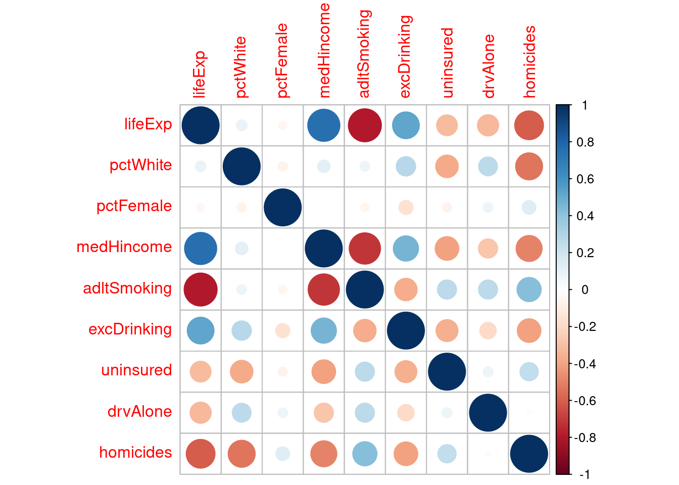
Figure 2.3: Correlation Matrix
In the correlation matrix, we see the correlation between our dependent variables and the independent variable, life expectancy. We found that some variables were highly correlated, for example life expectancy and adult smoking. While these variables are highly negatively correlated, adult smoking was far too important of a variable to omit. One seemingly strange correlation seen above is that excessive drinking is positively correlated with life expectancy. A result we were not expecting. Another interesting observation from the matrix was that percent female has almost no correlation with any of the other variables, yet certain variables, such as median household income, are generally strongly correlated in either direction with the majority of other variables.
One variable that we debated including was Homicides. In our early data exploration, we created an OLS model that included the 7 aforementioned variables and reported an \(R^2\) of 0.605. We found that when adding the homicide variable to this model, the \(R^2\) rose to 0.786, however, in doing so we lost 7,105 observations because the homicide variable only contained data on counties with 100,000 or more people. Figure 2.4, highlights the massive number of counties lost.
Figure 2.4: Map 2
At first glance at Map 2, this loss of observations seemed very significant. We see a large majority of US counties now “NA”, seemingly ruling out the possibility of adding it to our models. However, as we can see in Table 2.2, in losing these counties, we only lose roughly 10% of the total population.
| year | Total Pop Loss | Total Pop | Loss | % loss |
|---|---|---|---|---|
| 2017 | 289330063 | 325719178 | 36389115 | 11.17 |
| 2018 | 291589627 | 327167434 | 35577807 | 10.87 |
| 2019 | 293171308 | 328239523 | 35068215 | 10.68 |
| 2020 | 295688415 | 329484123 | 33795708 | 10.26 |
To ensure that this result was not strictly because of the loss of the observations without any homicides, we created a third OLS model, similar to the first.
This time the model was built on ONLY the 7,105 observations that do not have any homicides, which represents the 10% population loss.
We found that the \(R^2\) was 0.519, approximately only 15% less than the first OLS model but 41% less than the second OLS model.
So, while we do lose 10% of the population and 7,105 observations, we do not believe this 15% loss of explained variability in estimating life expectancy outweighs the benefit of including homicides in our model.
To better better visualize these results, view the Appendix.
This exploration has allowed us to gain a better understanding of our data and the relationship of the variables. We will now shift towards our next goal of using these data to run multiple regression models, exploring how our selected variables effect life expectancy.